Tuesday, December 17, 2013
Friday, December 13, 2013
Caption Writing
Edward Patterson rides through England today on his bike while showing a little skin. Patterson was later stopped by authorities and asked to cover up.
Paul Roberts of Ohio shows his Christmas spirit by hanging thousands of lights all over his property this month. Roberts' electric bill in the month of December is significantly higher than is normally is.
Paul Roberts of Ohio shows his Christmas spirit by hanging thousands of lights all over his property this month. Roberts' electric bill in the month of December is significantly higher than is normally is.
Thursday, December 5, 2013
Best Magazine Cvers 2013
1) informal
2) informal
3) informal
4) formal
5) formal
6) informal
7) formal
8) formal
9) environmental
10) environmental
11) informal
12) informal
13) formal
14) formal
15) formal
2) informal
3) informal
4) formal
5) formal
6) informal
7) formal
8) formal
9) environmental
10) environmental
11) informal
12) informal
13) formal
14) formal
15) formal
Magazine Tips
1) Make sure the photo is emotionally irresistible and arouses curiosity.
2) Don't judge the cover on screen because, it's not up to scale and it's virtual.
3) Cover should be intellectually interesting .
4) Cover should be efficient/fast/easy to scan.
5) Experiment with the elements and make some things pop more than others.
2) Don't judge the cover on screen because, it's not up to scale and it's virtual.
3) Cover should be intellectually interesting .
4) Cover should be efficient/fast/easy to scan.
5) Experiment with the elements and make some things pop more than others.
Tuesday, December 3, 2013
Tuesday, November 26, 2013
Fashion Photography
Video #1
1) made her neck longer
2) narrowed her shoulders
3) made her eyes bigger
4) arched her eyebrows more
Video #2
1) made her legs longer
2) made her arms longer
3) made her tanner
4) narrowed her stomach ad thighs
5) made butt smaller
6) made neck longer
7) made feet smaller
Video #3
1) lifted butt
2) made legs thinner
3) made butt smaller
4) added hair
5) lifted and shaped boobs
6) made hips smaller
7) made arms thinner
4) I don't believe it's ethical to chnge someone's appearance like this in a photo because, once you change it this much it doesn't even look like the person anymore.
5) Yes, all situations when this amount of manipulation is made is unethical.
6) Things like removing blemishes and minor wrinkles are okay, but when you start changing the person's body or facial structure, that's not okay.
7) Fashion photography is often used to sell a product or promote a certain designer, while in photojournalism we learn about a lot of different types of photography and use them to tell a story.
8) Each type of photography has a connection to the reality of the photographer. Personally, I don't think that affects the ethical practice of them.
9) I think these videos are being to shown to us so we can see the possibilities, and so we know what not to do.
10) Guy's bodies and faces are rarely Photoshopped the same amount as girls. The standards for girls' appearances are also higher than guys.
Wednesday, November 20, 2013
Rules of Photography Part 2
Rule of Thirds
Leading Lines
Symmetry and Patterns
Background
Depth
Cropping
Viewpoint
Framing
Balance
Avoiding Mergers
Leading Lines
Symmetry and Patterns
Background
Depth
Cropping
Viewpoint
Framing
Balance
Avoiding Mergers
Thursday, November 14, 2013
Self Portraits and Portraits Part 1
1. Alter Your Perspective
2. Experiment with Lighting
3. Shoot Candidly/Move Your Subject Out of their Comfort Zone
Environmental Portraits
I picked these photos because they tell a story and show the subject's environment.
Self Portrait
I picked these self portraits because, they're creative, unexpected, and not your typical self portrait.
Casual Portrait
I picked these photos because, they are simple and don't appear too posed.
For my portrait assignment, I plan on shooting a few of my friends and my little sister. I'll most likely shoot in and outside my house, but if I'm lucky I'll shoot some downtown. To take successful photos, I will use the rules of photography and the 3 tips listed above. I'll also take multiple photos to make sure I get a good one.
Thursday, November 7, 2013
DSLR
1) 2.8, 4, 5.6, 8, 11, 16, 22
2) 1 sec, 1/60 sec, 1/4000 sec
3) 100, 200, 400, 800, 1600, 3200, 6400, 12800, 25600
2) 1 sec, 1/60 sec, 1/4000 sec
3) 100, 200, 400, 800, 1600, 3200, 6400, 12800, 25600
Wednesday, November 6, 2013
ISO
ISO 200
ISO 6400
1) The advantage of using high ISO is you can capture movement when there isn't enough light.
2) The author suggests using the lower ISO most often and when there's plenty of light.
3) High ISO should be used when there's not enough light.
ISO 6400
1) The advantage of using high ISO is you can capture movement when there isn't enough light.
2) The author suggests using the lower ISO most often and when there's plenty of light.
3) High ISO should be used when there's not enough light.
Shutter Speed
Slow Shutter Speed

1) a. fast
b. fast
c. fast
d. fast
e. fast
f. fast and slow
2) a. slow
b. slow
c. fast and slow
d. slow
e. slow
f. slow
3) Auto: camera automatically sets shutter speed
Shutter Priority: you set shutter speed/camera sets aperture
Manual: you set shutter speed and aperture
Tuesday, November 5, 2013
Apperture
F2.8
F16
1) the eye (pupil)
2) The smaller the aperture opening, the higher the aperture f-stop number.
3) The aperture size effects the amount of a photo that appears in focus, or the depth field. The bigger the aperture, the smaller the depth field.
Funny Captions
Stephen tried to tell the McDonald's employee he spelled his name with a ph.... She obviously didn't comprehend.
Peter the pug is not too happy with his Halloween costume. His owner obviously loves Starbucks.
Thursday, October 10, 2013
Great Black and White Photographers PART 3
1) His photos first caught my attention because, they looked surreal and they told a story.
2) Photo 1:
I see a a boy standing in a large body of water. It looks as if he walked across the path of stepping stones to get there. The boy is looking at the gorgeous view of mountains across the water.
I smell the fresh, moist air that always seems to come off the water. It feels very refreshing. I hear the shallow water. It sounds very calming and still. I feel calm when imagining myself in this photo. It's very simple and gives me a content vibe.
Photo 2:
I see continuous rows of lots of very similar houses. It looks very cluttered from the view we're given. I hear the quiet streets as the result of what looks like early morning time. I smell smoke from the chimney's of the inhabited houses. I feel the smooth stone that the houses are made of.
3) I would like to create a power point about my photographer.
Mural Project Preview
1) A theme that we could take here at school for this project would be education or school spirit.
2) I think we should open up cameras to people that don't have camera phones.
3) In my opinion we should put the mural up somewhere in the courtyard or near/in the art hall.
2) I think we should open up cameras to people that don't have camera phones.
3) In my opinion we should put the mural up somewhere in the courtyard or near/in the art hall.
Wednesday, October 9, 2013
Abandoned Theme Parks
1) Koka Family Land in Shiga, Japan and Tokakanonuma Greenland in Hobara, Japan were my favorite theme parks of the bunch. Tokakanonuma Greenland has a creepy yet vintage feel to it that makes me want to visit. Koka Family Land is the least creepy of all of them and has a beauty about it that makes me want to visit. I would love to visit both of these places and take pictures.
2)
3) abandoned buildings, haunted hotels, swamps, junk yard, construction sites
4) Abandoned building- Mathias Hacker
5) I would love to take pictures in these places because, they really interest me. I like the element of nature taking over the abandoned space. I would expect to take pictures like the one above, or pictures with people in them.
6) For me to be able to take picture in these locations it would take a lot of research and traveling. I would need a camera, tripod, and lenses. I would also need to take into consideration trespassing and breaking and entering laws.
Tuesday, October 8, 2013
Africa
1) In this article, photographer Nick Brandt is interviewed. He tells the interviewer about how endangered animals are his inspiration. Also, he talks about getting up close and personal to take his photos rather than using a special lens to zoom.
2)
3) In this picture, there are two lions touching heads. This photo is my favorite because, it's simple but it tells a story.
4) An evident rule of photography in the picture is simplicity because all focus is on the subjects and the background is simple.
5) He uses a Pentax 67II with 2 fixed lenses.
6) His reason for taking these photo's is to show these endangered animals just 'being' in there habitats before they are no longer.
7) His hope for these photos is to show people these beautiful animals that are disappearing at our hands and make them want to do something.
8) " There is also something deeply, emotionally stirring and affecting about the plains of Africa—those vast, green rolling plains punctuated by graphically perfect acacia trees under the huge skies."
Friday, October 4, 2013
Peer Reflection
1. http://zoegarrison.blogspot.com/
2. In my opinion, the rule she best replicated was rule of thirds because, her subject is not in the center.
3. In my opinion, the picture she chose for simplicity wasn't the best because, the background is cluttered and the focus isn't on the subject.
4. Her pictures are very good and shot at a nice angle.
5. Something she could improve on is clearly focusing her camera before shooting her picture.
Thursday, September 26, 2013
The Story
I think this photo tells the best story. It looks as though they are all coming together to pray for something or someone.
Tuesday, September 24, 2013
Photo Manipulation and Ethics
Part One
A) This article was about photojournalists that Photoshopped pictures taken of famous events. The photo editing that occurred in these instances however was unethical.
B) I believe this type of photo editing is unethical because, by doing things like cloning over women in a photo or Photoshopping in the 4th missile of the launch, the journalists are basically lying about what they photographed.
Part Two
A) I feel that this photo is the most unethical because, they are trying to make her out as something she's not. This is a good example of why young girls have unrealistic image expectations placed upon them in today's society.

B) This photo seems the least unethical to me because, it just looks like the lighting has been enhanced.
A) This article was about photojournalists that Photoshopped pictures taken of famous events. The photo editing that occurred in these instances however was unethical.
B) I believe this type of photo editing is unethical because, by doing things like cloning over women in a photo or Photoshopping in the 4th missile of the launch, the journalists are basically lying about what they photographed.
Part Two
A) I feel that this photo is the most unethical because, they are trying to make her out as something she's not. This is a good example of why young girls have unrealistic image expectations placed upon them in today's society.

B) This photo seems the least unethical to me because, it just looks like the lighting has been enhanced.
Friday, September 20, 2013
Framing
In this photo the rescue firefighters are surrounding the injured and it causes him to be the center of focus.
Wednesday, September 18, 2013
Balance
In this photo, the small buildings in the back create geometric shapes while the women in the foreground balances the photo.
Lines
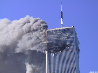
In this photo, the verticle lines of the building direct your eyes to the falling man. These lines make the photo feel more dynamic.
Rule of Thirds
In this photo, the focus isn't directly in the middle. The subject has been place in the rule of thirds.
Subscribe to:
Posts (Atom)


